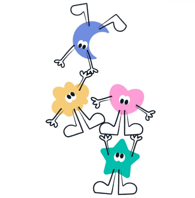
The UK’s only wish granting children’s charity which solely supports children living in poverty, Dreams Come True, is thrilled to announce a comprehensive rebrand featuring a brand-new logo design and website relaunch.
The fresh visual identity introduces four playful mascot characters that capture the joy, happiness, fun and magic of the spirit of childhood, perfectly embodying the charity’s mission to deliver life-changing dreams for children living with serious illnesses, disabilities, and life-limiting conditions who are living in the highest areas of deprivation in the UK today.
The rebrand comes at a crucial time when more children than ever are facing hardship with 5.2 million children living in poverty, equivalent to 1 in 3 and rising to 1 in 2 in some areas, the need for Dreams Come True’s work has never been greater.
Research shows that children with disabilities are 11% more likely to experience poverty, and 52% of families with disabled children or serious illnesses live below the poverty line.
The new rebrand is designed to resonate with this purpose by presenting a vibrant, dynamic identity that reflects happiness, creativity, joy and fun.
The four mascots characters serve as ambassadors for the charity’s work, symbolising the diverse and joyful experiences that every child deserves, whether it’s a tailor-made family moment, a bespoke item of much needed equipment or an unforgettable adventure.
Dreams Come True CEO Lisa King OBE said: “Our new visual identity and website are not just a facelift, they are a reflection of our commitment to bringing joy and magic to children who need it most.
“The playful mascot characters in our logo encapsulate the essence of childhood and the joy, happiness, fun and magic of a dream. This is a pivotal moment for us, and we’re excited for the journey ahead.”
The new identity was developed pro bono by top London creative agency Leo Burnett, known for its ethos of ‘Populist Creativity’, and expertise in creating brands and campaigns that resonate deeply with audiences.
A spokesperson from Leo Burnett said: “We believe in the power of creativity to make a real difference in people’s lives, and this project was incredibly special to us. The four characters at the heart of the rebrand reflect the spirit of Dreams Come True; imaginative, playful and full of heart. Our goal was to create an identity that inspires magic making, raises awareness, and ultimately helps deliver even more dreams to children who need them most.”
Coinciding with the rebrand and website launch is the exciting announcement of a new strategic partnership with The Big Table Group.
Known for its leading restaurant brands across the UK, including Bella Italia, Las Iguanas, Banana Tree, Frankie & Benny’s, and Chiquito, The Big Table Group brings a wealth of expertise, creativity, and national reach.
With over 230 restaurants and a team of more than 5,000 people, this partnership will not only amplify Dreams Come True’s profile but also drive vital fundraising initiatives and community engagement throughout 2025.
Lisa continues: “Our rebrand is timed with our Big Table Group partnership launching. Thanks to the huge reach the Group offers, our charity and its work will be seen by thousands across the country. This is a high profile first for us and gives us a unique moment to launch our new visual identity. We are thrilled.”
The rebrand marks a new chapter for Dreams Come True at a time when the need for support is greater than ever. The charity invites supporters, partners, and the public to celebrate this transformation and join the cause as #DreamMakers. With enhanced visibility, innovative fundraising campaigns, and a partnership that spans the nation, 2025 is set to be a year of remarkable impact.


